Pendelti
Brief
Pendleti was created to address the need of soccer fans who want to express their deep love for their favorite team. For many, there are significant moments and special seasons that make their connection to the team more personal. The brand name, Pendleti, is a combination of the words "penalty" and "tee" (as in t-shirt), and this fusion creates a reference to the word "penalty" in English – *Penalti*, symbolizing the strong connection between the game and the
penalty kick.

The challenge
The challenge is that many soccer fans are looking for shirts from their teams and memorable seasons that hold special memories, but these shirts are hard to find on their own today.
My solusion
The establishment of Pendleti was aimed at gathering retro soccer shirts and offering them to the public.
.jpg)
Graphic design
the design tone is inspired by the retro style of the 80s, meant to reflect the theme of the brand: retro soccer shirts. During the design process, I incorporated images of legendary players from the past in iconic moments, and these images were given the brand's colors. We also used trophies representing major tournaments in the world of soccer, all to capture the main vibe of the brand – a love for soccer


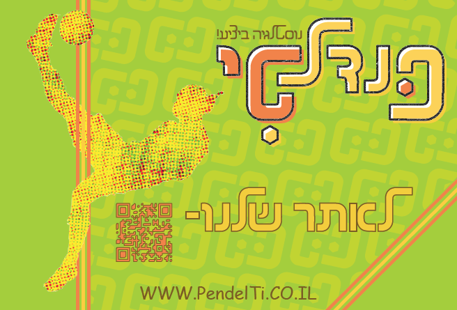

The logo
The logo was created using the "Plastic" font by "The Guild." The letter "P" is essentially a flipped version of the letter "T." By shifting the letters "P" and "T," the bottom part of the logo was formed. Hexagonal shapes were added as diacritical marks, representing the patches that make up a soccer ball

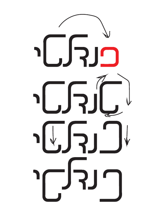
The logo was colored in a way that slightly extends beyond the outer line, simulating an old print. The chosen colors were selected to avoid representing any specific soccer team


